 SurgePix Docs
Slide Design Prompts That Actually Work (30+ Copy-Paste) — SurgePix
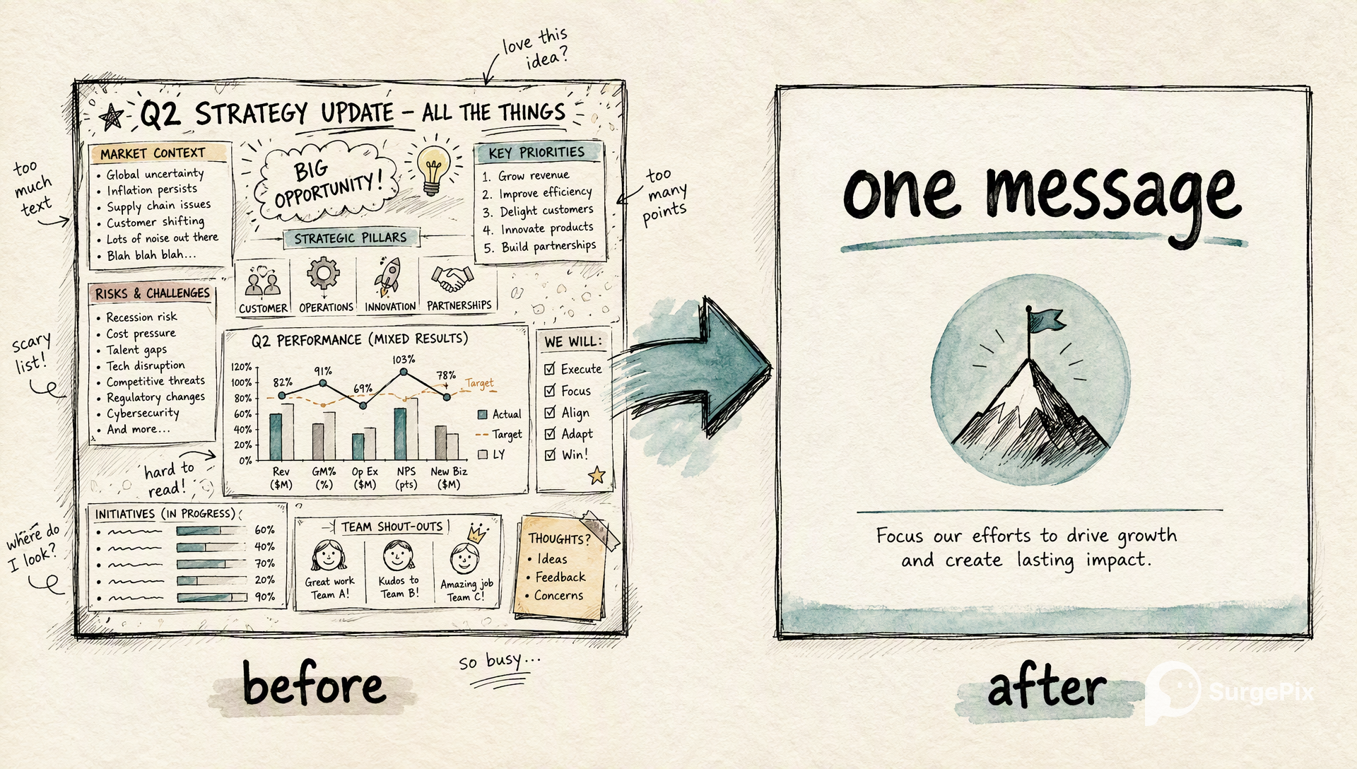
Most AI slides come out generic — centered text, a random stock look, no hierarchy. The fix isn't a new tool; it's a better slide design prompt. A good one tells the AI the layout, the focal point, the palette and the hierarchy — so the slide looks designed, not defaulted. Below are 30+ copy-paste slide design prompts for building and, just as often, redesigning slides. Use them to generate, then edit every layer in SurgePix until it's clean.
What makes a slide design prompt work
- Name the layout — "title left, one visual right," not just "make a slide."
- One focal point per slide — tell it what the eye should land on first.
- Set hierarchy + a text cap — "one headline, one point, ≤15 words of body."
- Specify palette & type — one accent color, one display font, one body font.
- Ask for white space and alignment — the two things that make cheap slides look expensive.
Overall look & style
- Redesign this slide in a clean, minimal style: one accent color, generous white space, a single focal point, sans-serif, ≤15 words of body text.
- Give this slide a McKinsey/consulting look: an action-title headline that states the takeaway, restrained palette, one chart, everything aligned to a grid.
- Make this a bold, modern startup keynote slide: oversized headline, high contrast, one full-bleed visual, almost no body text.
- Editorial magazine style: strong typographic hierarchy, a large pull-quote, asymmetric layout with intentional white space.
- Dark premium keynote look for a big screen: near-black background, one bright accent color, large type, minimal elements.
- Friendly, approachable style for a non-technical audience: rounded shapes, warm palette, one simple icon, plain-language headline.
Layout prompts
- Lay this slide out as headline + one supporting visual on the right, text on the left, vertically centered.
- Turn this into a big-number slide: one huge stat, a one-line context under it, everything else stripped away.
- Design a comparison slide: two columns with clear headers, matched rows, and the winner highlighted.
- Make a section-divider slide: large section title, small number, lots of empty space, calm.
- Three-column feature layout: an icon, a short bold header, and one line of text in each column.
- Quote slide: one large quote, small attribution beneath, a calm uncluttered background.
- Agenda slide: a clean numbered list, one line each, with the current section subtly emphasized.
Redesign / fix an existing slide
- This slide is too busy — cut the text by half, establish clear hierarchy (one headline, one point), and align everything to a grid.
- Make this slide skimmable in 3 seconds: one message, big; everything else made supporting or removed.
- Rebalance this slide — it feels lopsided; distribute the elements evenly and add breathing room.
- Keep the content but restyle for consistency: match the fonts, palette, title position and spacing to the rest of my deck.
- Reduce this bullet list to a single visual: turn the 6 bullets into a simple 6-step flow with short labels.
Color & typography
- Apply a professional palette: one primary color, one accent, neutral text — and use it consistently.
- Fix the typography: one display font for headings, one for body, a clear size hierarchy, generous line spacing.
- Use our brand colors [hex] and [hex] — accent on the headline and key numbers, neutral for body.
- Make it accessible: high text-to-background contrast, minimum 18pt body, no color-only meaning.
Data & chart slides
- Design this chart slide: the chart fills ~60% of the space, an action-title takeaway on top, one highlighted data point, everything else muted.
- Turn this table into a clean visual: highlight the key row, mute the rest, add a one-line insight above it.
- Simplify this chart: remove gridlines and clutter, label directly, and let one color carry the message.
Whole-deck consistency
- Make every slide in this deck look like one system: same fonts, palette, title placement, margins and spacing.
- Create a simple slide master: define heading style, body style, accent color and a consistent title position, then apply it to all slides.
Design is editing, not a re-roll
Here's the thing about design: you rarely nail it in one generation. A slide gets designed by adjusting — move the focal point, cut a line, swap the palette, align to the grid. Most AI tools only let you re-roll and hope. In SurgePix you generate the slide, then edit every layer — text, image, chart, color, layout — and apply the same look across the whole deck. That's how these design prompts become finished slides.
→ Try a design prompt in SurgePix (free daily credits).
FAQ
- What is a slide design prompt? An instruction that tells an AI how a slide should look — its layout, focal point, hierarchy, palette and type — not just what it should say.
- Why do my AI slides look generic? The prompt only described content. Add layout, one focal point, a text cap, and a palette, and the slide starts looking designed.
- Can I redesign an existing slide with a prompt? Yes — use the "redesign/fix" prompts above, then fine-tune each layer in SurgePix.
- How do I keep a whole deck consistent? Use the whole-deck consistency prompts, then edit in SurgePix so fonts, palette and spacing match across every slide.
- Do these work in other languages? Yes — write the prompt in your language; the design instructions apply the same way.